Federal Trade Commission Redesign
The Problem
Users are finding the website confusing and overwhelming.
The Solution
By creating a more modern sleek website with a more comprehensive dropdown menu we can alleviate users’ concerns.
Role
UI Designer
User Interface Analysis, Testing, Navigation Prototyping, Card Sorting, Wireframing, Prototyping, and User Testing.
Desingers
Blair Norris, Dominique Maxwell and Elise Rosado
Background
My cohort was assigned to redesign a government website. My team and I chose to do the Federal Trade Commission. The goal was to understand how people use the navigation and website content to design a new website solution for the desktop.
As a Team:
- Conducted usability testing
- Created a user path
- conducted a heuristic evaluation
Individually:
- Card sorted and created a sitemap
- Designed a navigation prototype
- conducted multiple user testings
Understanding The Problem
As a group we researched the main reasons users come to the FTC website and created a user path from there. We found many users come to the website to report identity theft. We then walked through the process of reporting identity theft.
Our Findings:
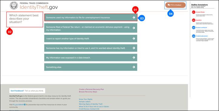
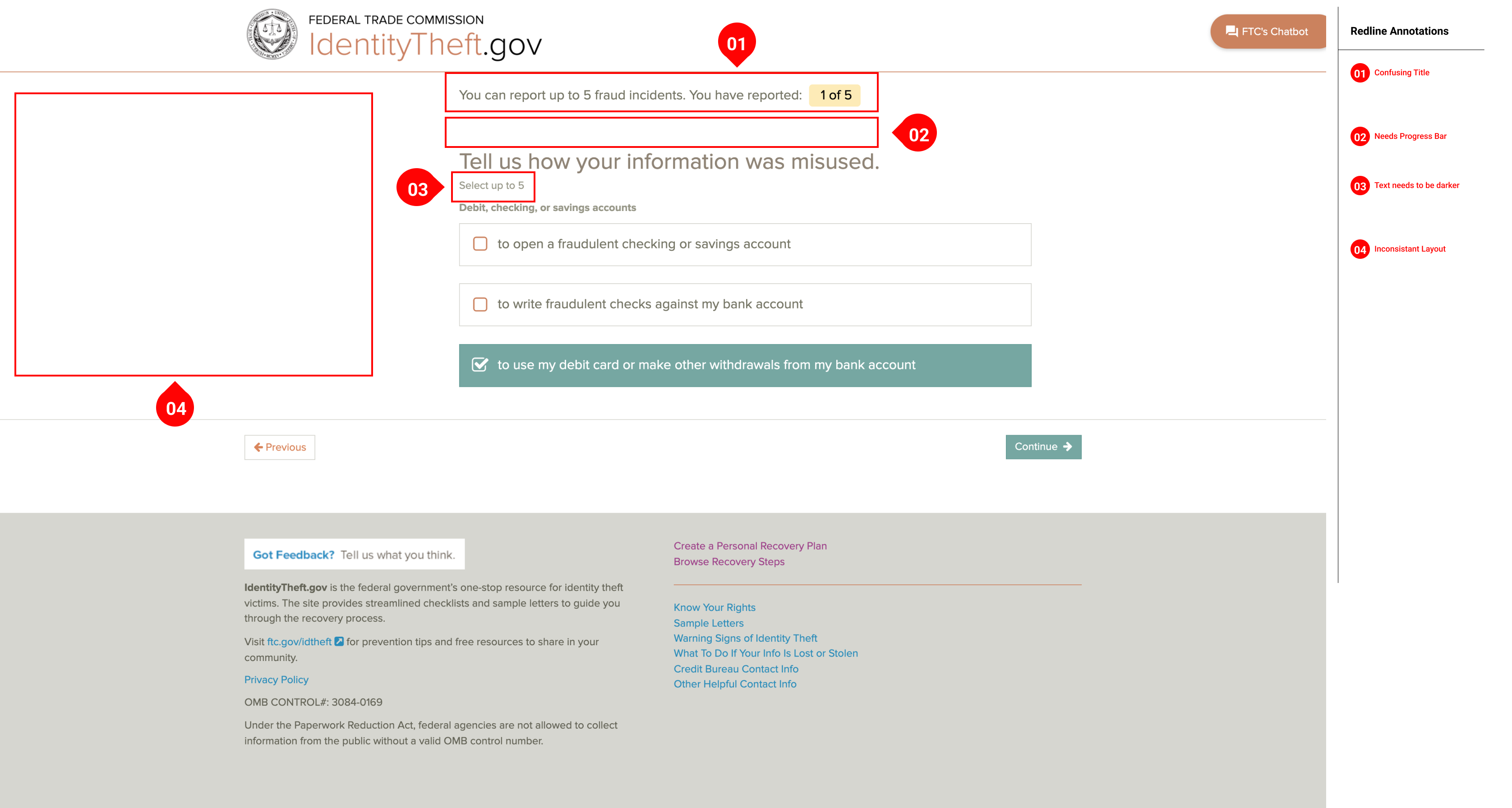
- UI was different on each page
- Buttons were inconsistent
- The process was not seamless
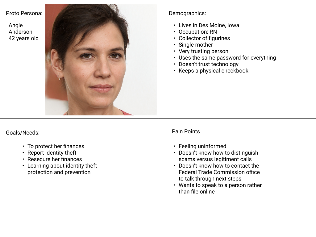
Proto Persona
Based on our research, we determined our user, Angie, and we wanted to solve her problem.
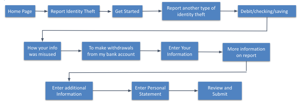
User Path
This user path outlines how Angie would navigate through the Federal Trade Commission site to report identity theft.
Interview Planning
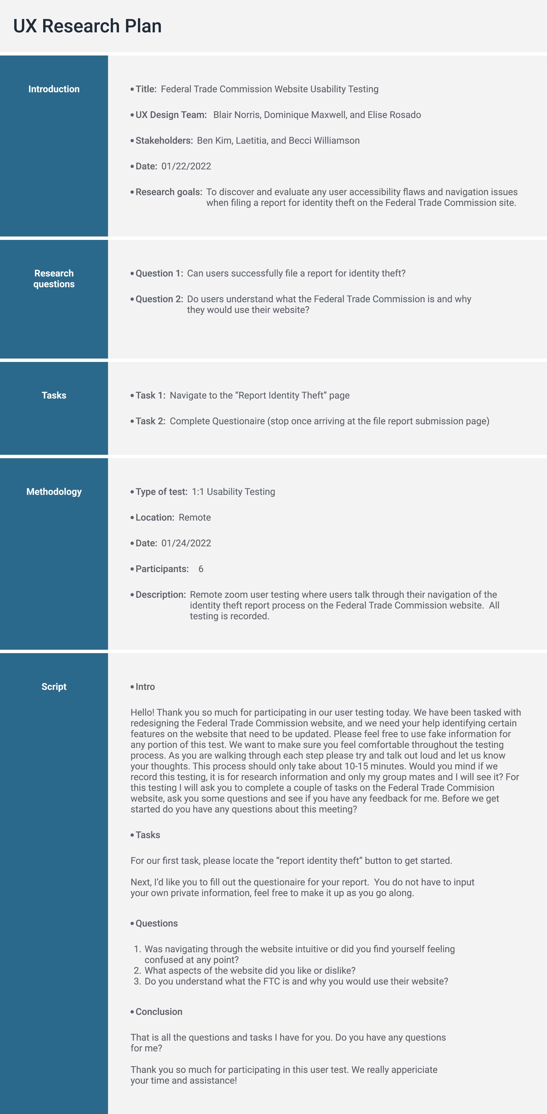
Before conducting our user testing, our team created a research plan to determine the main issues of the FTC website
Usability Testing Insights
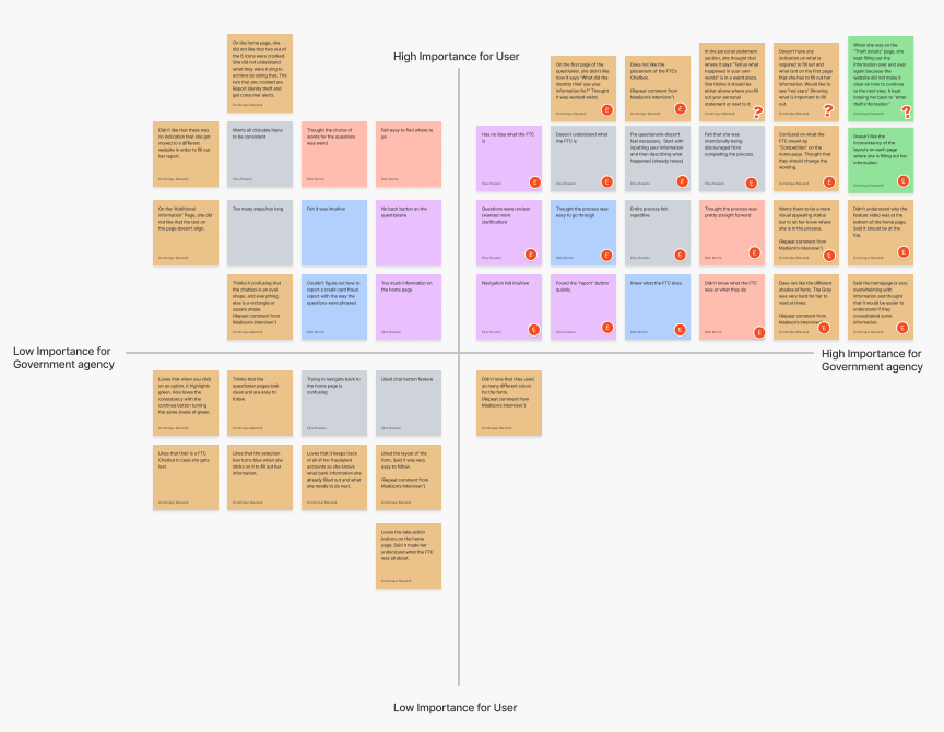
After completing a total of 6 user tests, we discovered accessibility issues and user obstacles when reporting identity theft on the site. This user feedback was gathered into a 2X2 matrix to determine what insights would be high priority for both users and our government agency.
Navigation Analysis
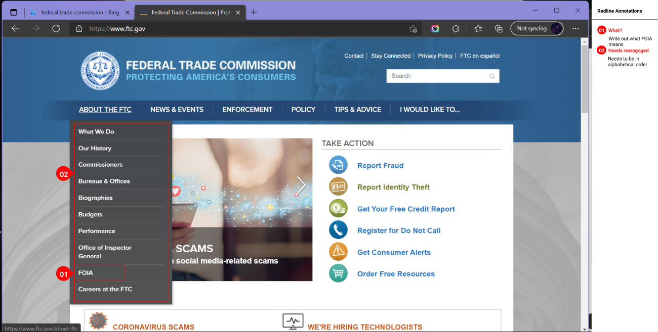
As we continue to redesign the FTC website, we analyzed the navigation bar. Through our research a few items jumped out at us:
- There were too many secondary pages
- Certain secondary pages did not belong in their given categories
Card Sorting
After redlining the navigation bar I began card sorting. As I was sorting every page I tried to make sure there were not too many primary pages on the navigation bar. It proved to be very challenging because so many of the secondary categories did not line up with the primary titles.
Site Mapping
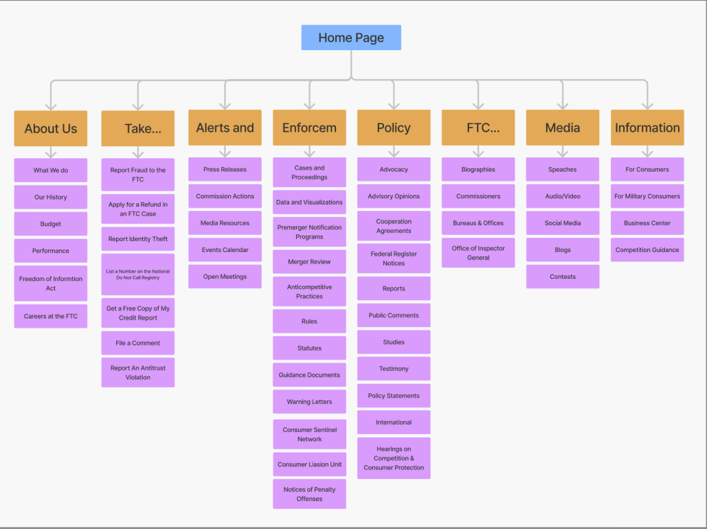
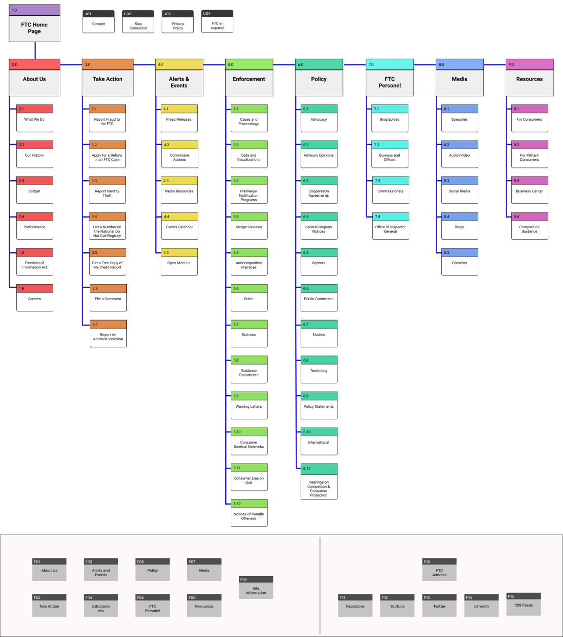
After finishing the card sorting, we moved on to creating a sitemap. With our sitemap, we added more color, structure, and a more visible hierarchy.
Navigation Prototyping
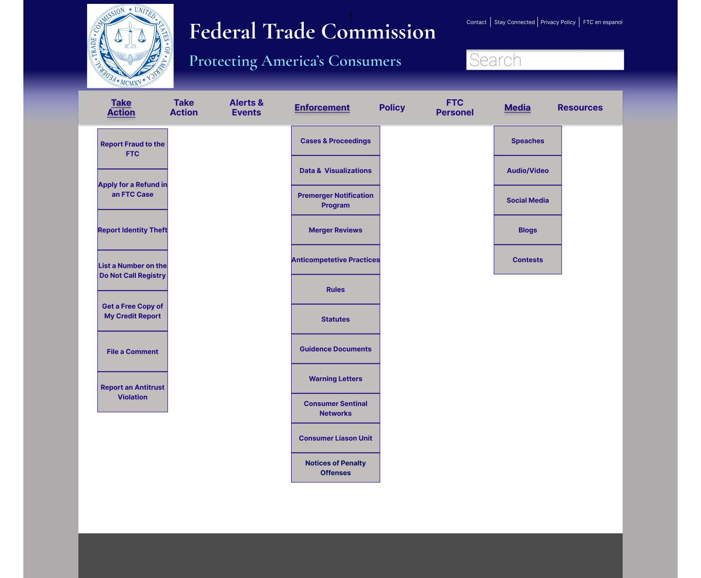
I matched my sitemap when creating this prototype. Since I added two more primary pages, I also made the website wider and fits into 8/12 grid lines. Throughout the process of creating this prototype, I ran into some issues with the components to work with the hovering option. I have made it to only show the menu dropdown when hovering over the Primary page for this prototype.
Prototype Iterations
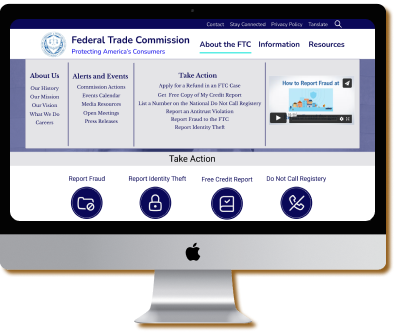
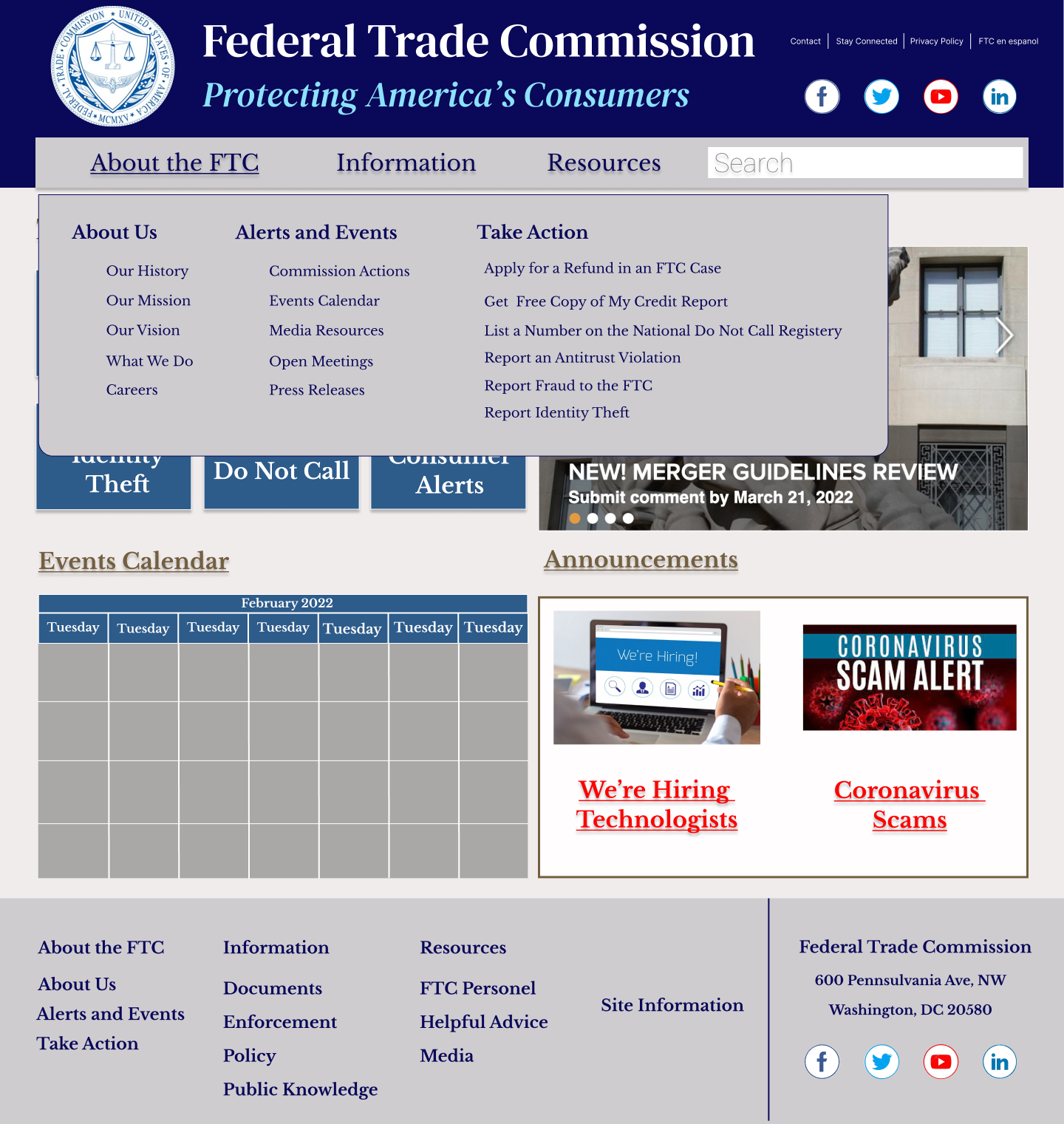
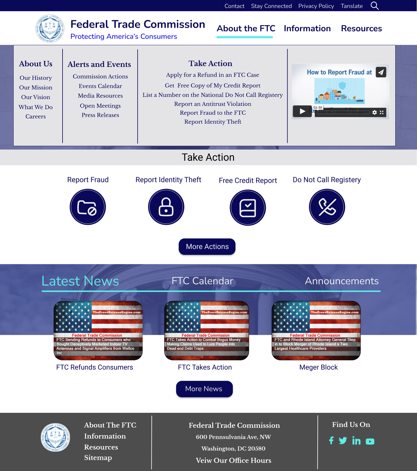
After my first round of testing on my navigation bar, I was given the feedback of changing my menu bar to a mega menu. I put that into my next iteration along with adding more information to the website.
Prototype Testing Results
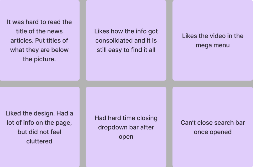
I continued to test after every iteration to make sure what I am designing is user-friendly and met the solution to our original problem.
The feedback I received:
Final Prototype
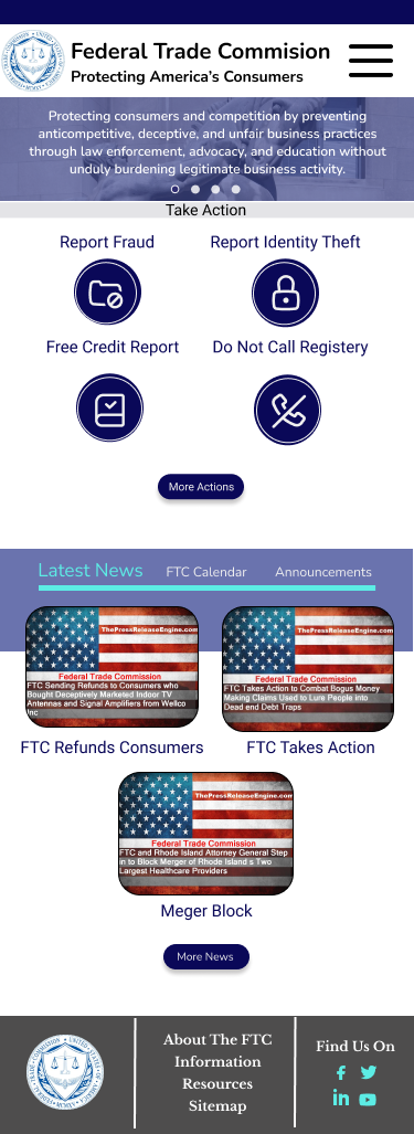
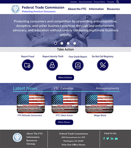
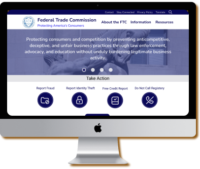
After iterating my prototype to the feedback I was given in user testing I finished my final prototype. As I designed the desktop prototype I wanted to make sure it was responsive. You will also see the final prototype for mobile as well. To test prototype please click on the images below.

