MaxFund Nonprofit Redesign
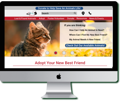
The Problem
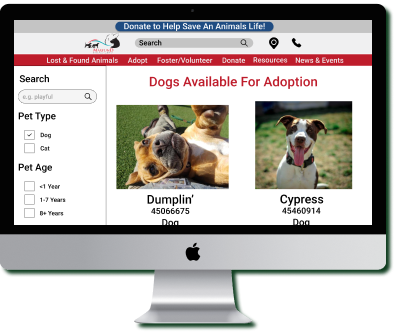
It is time-consuming for users to read through each description to find the pet they are looking for.
The Solution
By creating a filter system we can help users find the animal they are looking for quicker.
Role
UI Designer
User Interface Analysis, Testing, Navigation Prototyping, Card Sorting, Wireframing, Prototyping, and User Testing.
Desingers
Blair Norris, Sarah Bacon, Red Castro and Austin Kudrna
Background
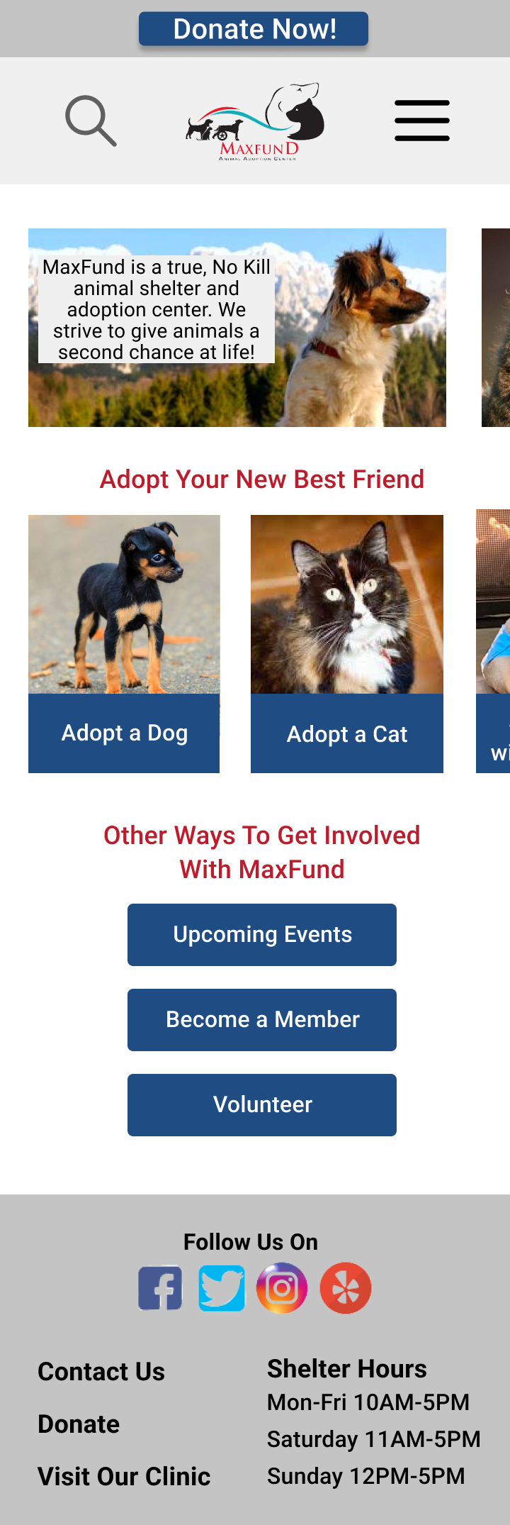
My cohort was assigned to redesign a local nonprofit website. My team and I chose to do MaxFund, a no kill animal shelter. The goal was to redesign a responsive web design based on our user research.
As a Team:
- Conducted usability testing
- Created a user path
- conducted a heuristic evaluation
Individually:
- Card sorted and created a sitemap
- Designed a navigation prototype
- Conducted multiple user testings
Understanding The Problem
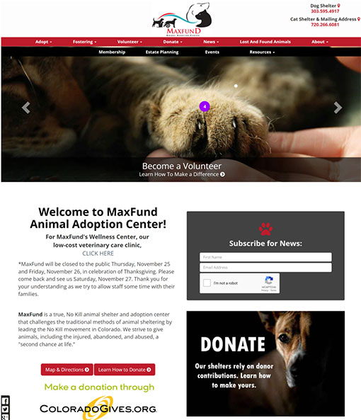
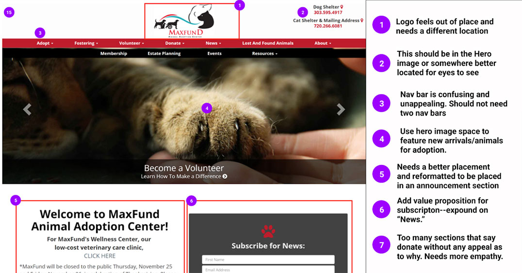
As a group, we walked through the MaxFun website to understand why users would visit this site. From what we found most users visit this website to find an animal to adopt while others came to donate to their cause. From there we conducted a heuristic evalution.
Our Findings:
- The double navigation bar could be confusing to users
- Not enough information in the hero images
- The homepage felt like an overwhelming amount of information
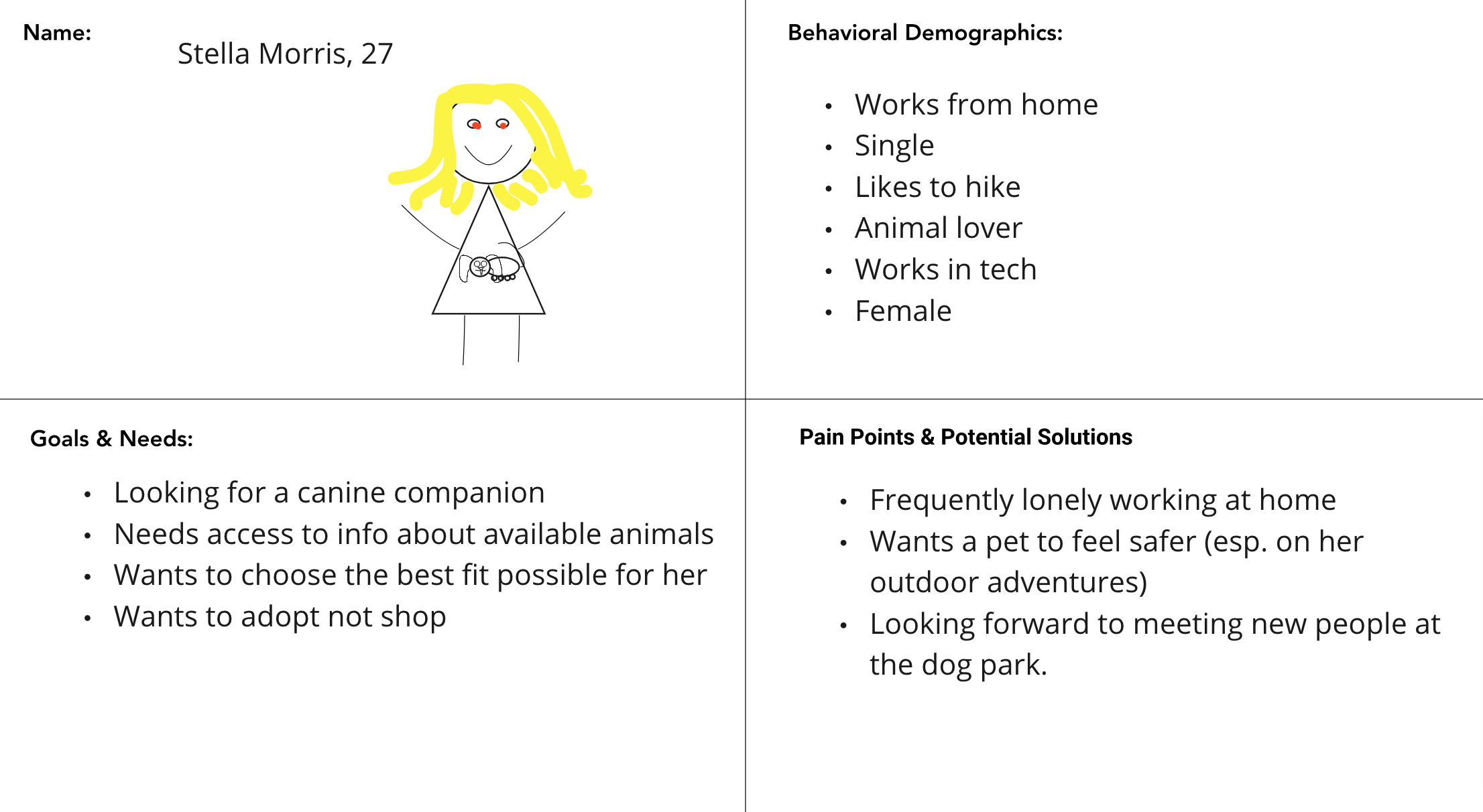
Proto Persona
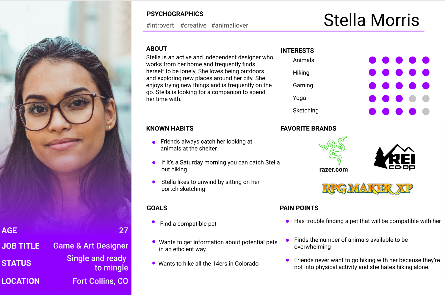
This is our user, Stella. As we continue through our research Stella is at the forefront of our minds.
User Research
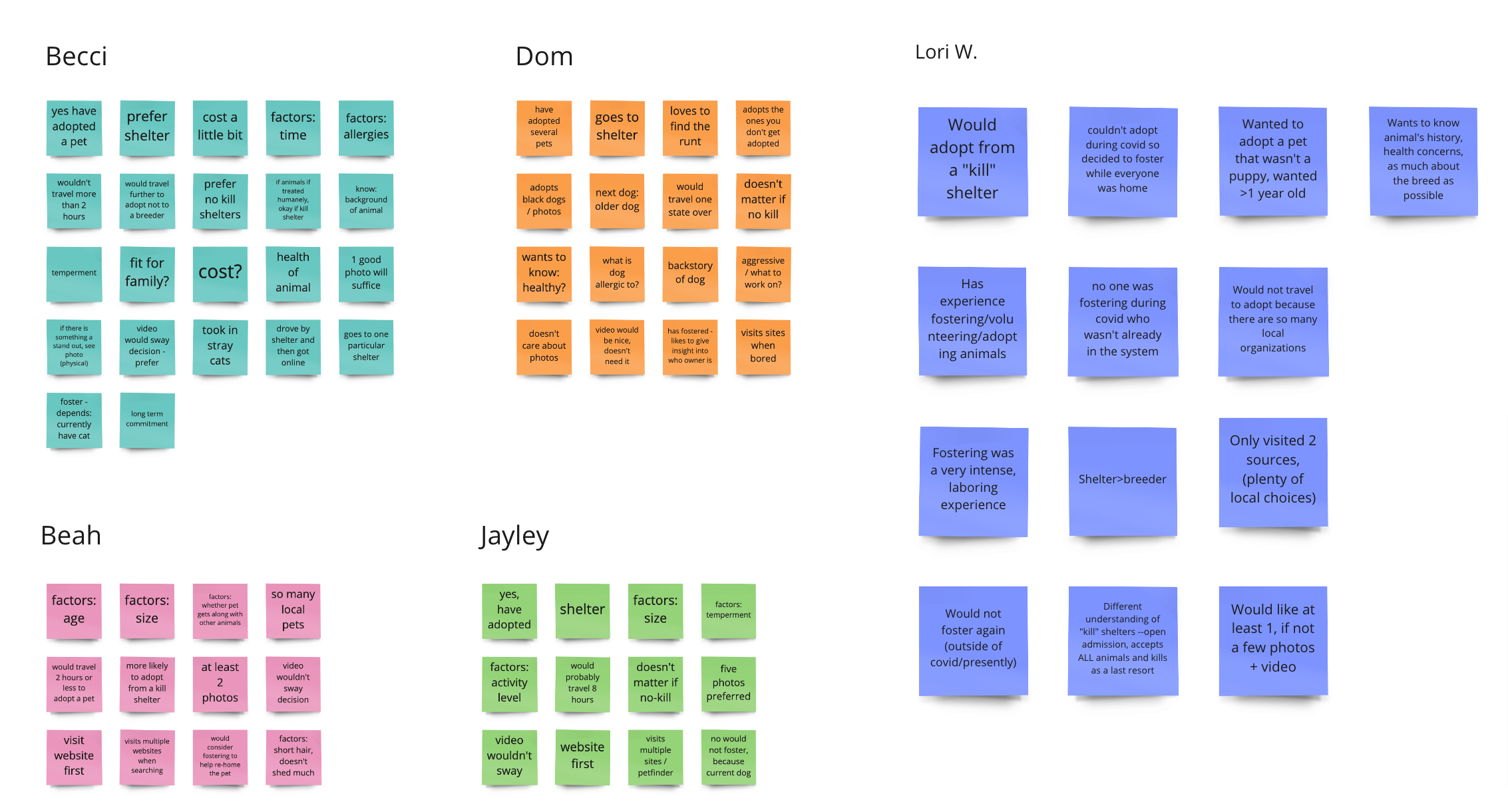
We conducted 8 user interviews to get more insight from users. Below is the feedback we received.
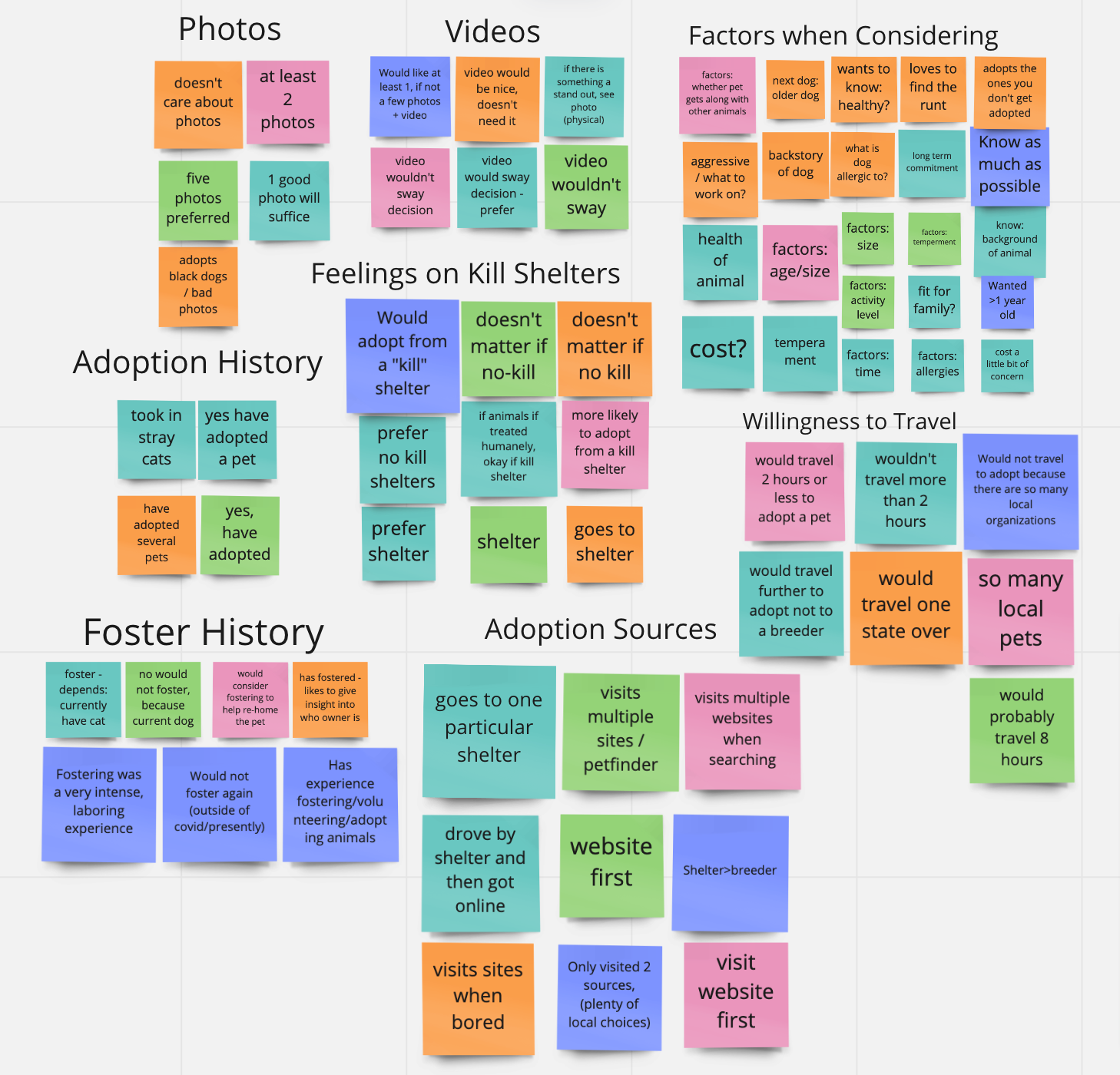
To consolidate our user feedback we put it all into an affinity diagram using Miro for a better understanding of what users want.
User Persona
Once we completed our first round of user testing we updated Stella’s information and created her user persona.
Storyboard
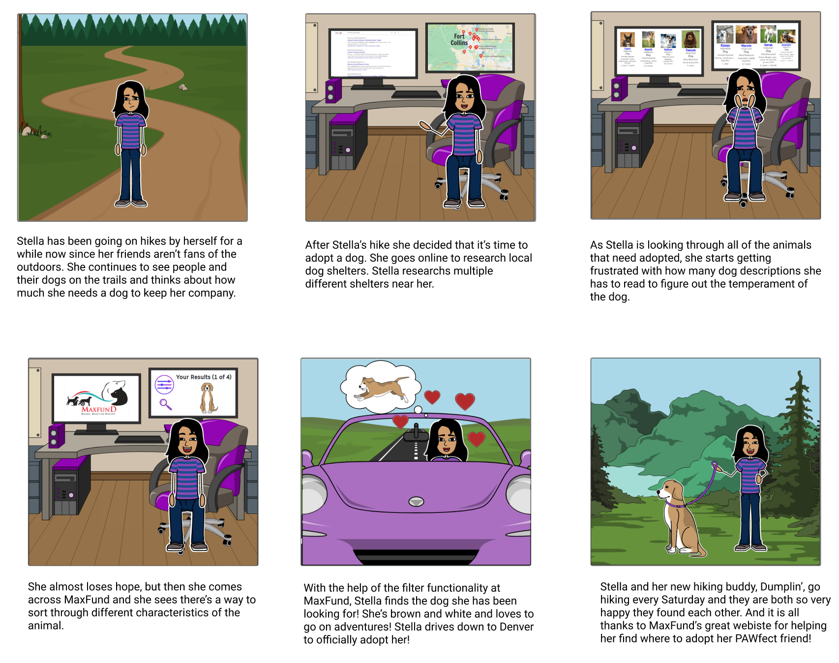
Here we will live a couple of days in the life of Stella.
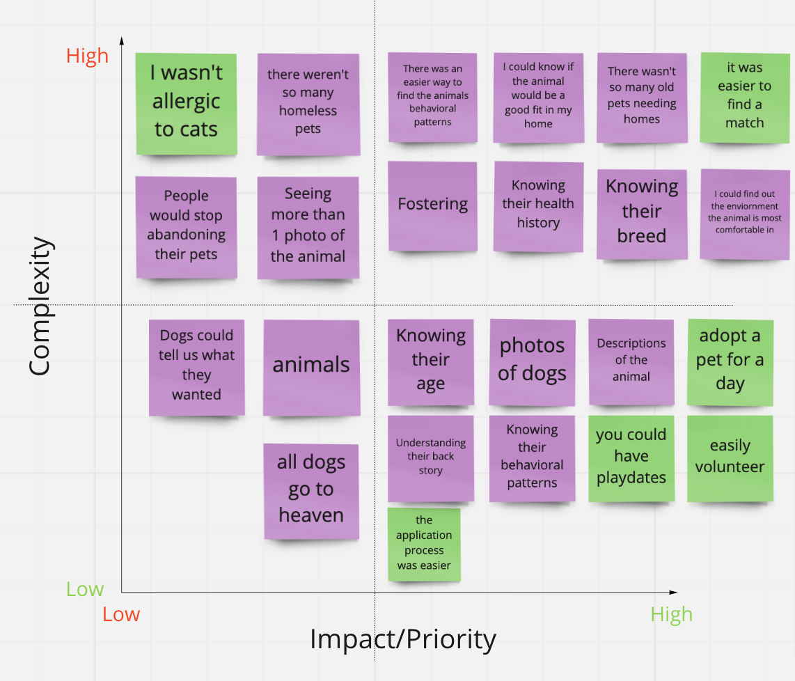
Feature Prioritization Matrix
This helped us reveal what features users want most.
Main features:
- More information on the animal
- An easier adaption process
- An easier way to find the best pet match
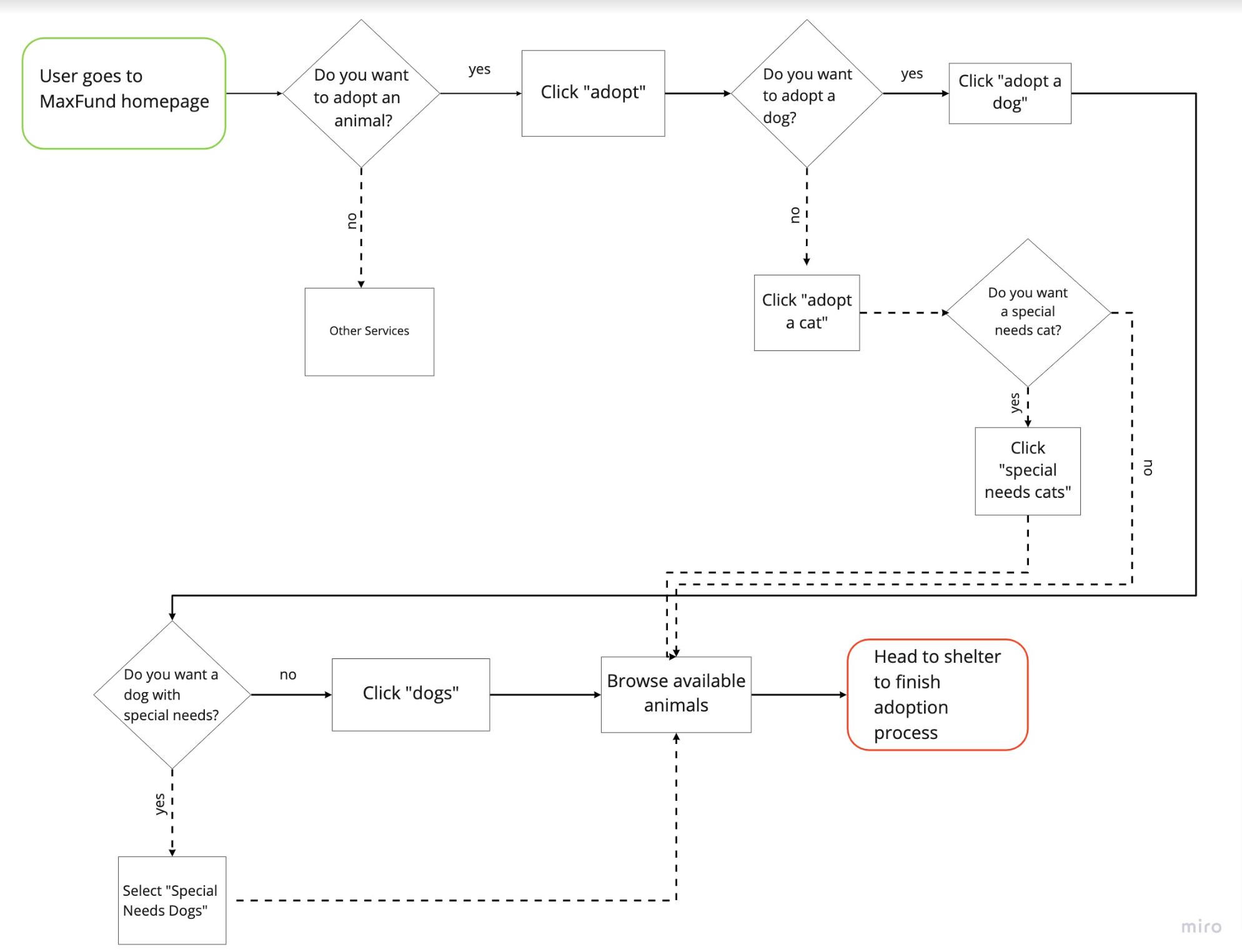
User Flow
Before we create our prototype we made sure to create the user flow. We wanted to highlight the happy path we were working on.
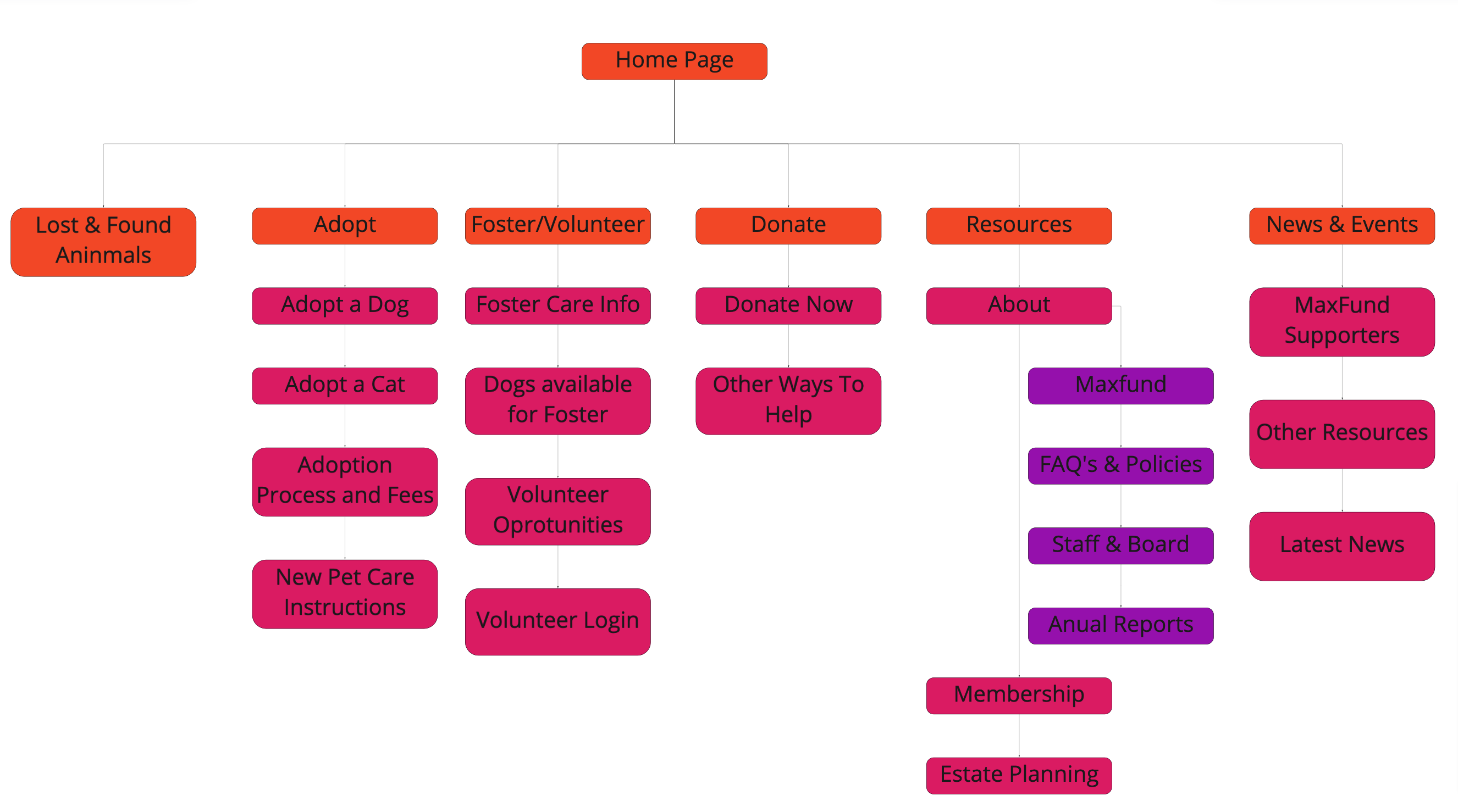
Card Sorting
As we shift into redesigning the navigation bar, we start with card sorting.
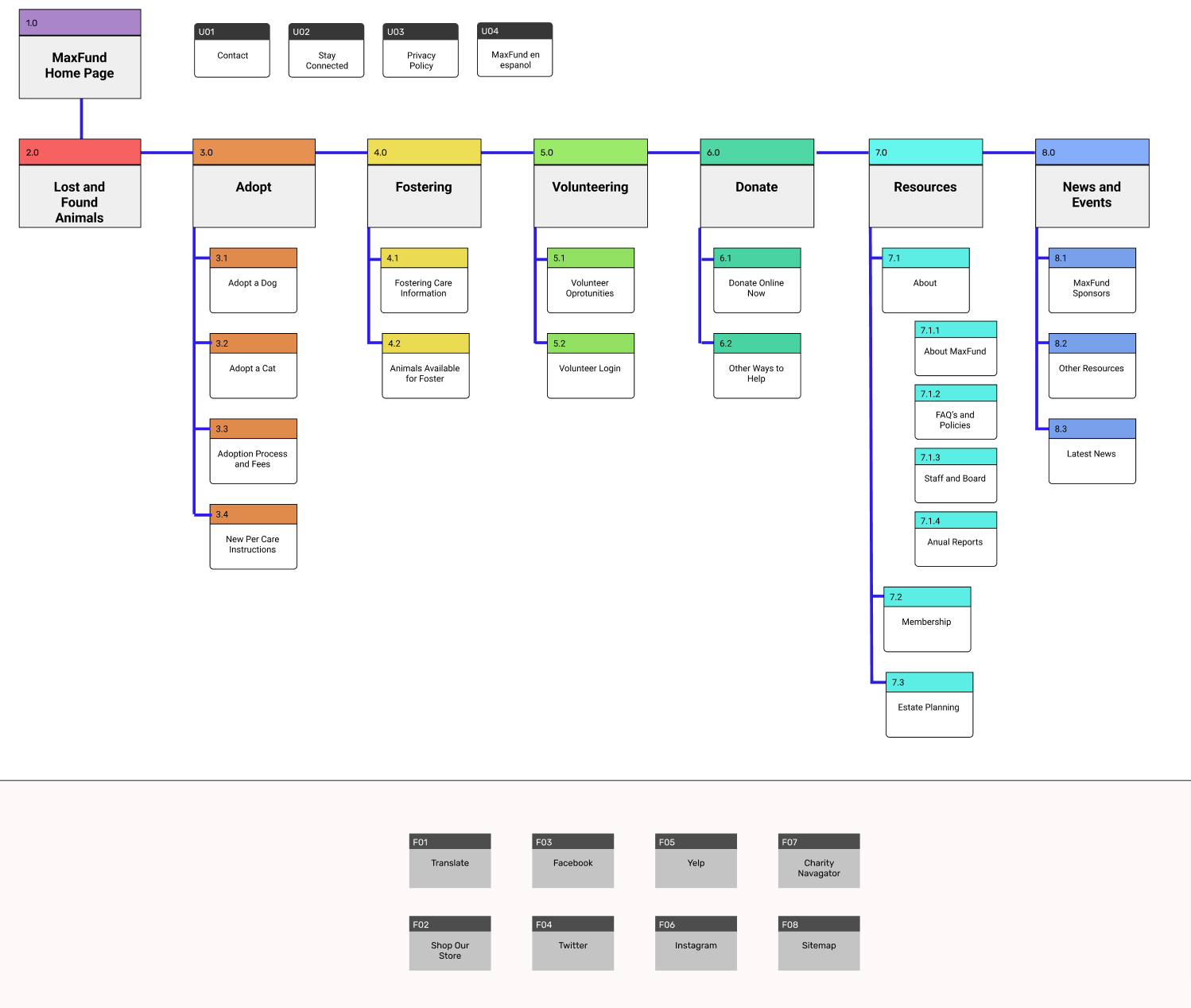
Site Mapping
After finishing the card sorting, we moved on to creating a sitemap. With our sitemap, we added more color, structure, and a more visible hierarchy.
Navigation Prototyping
As we create the navigation prototype we wanted to make sure we had the colors from the color palette involved while hovering or clicking on certain pages.

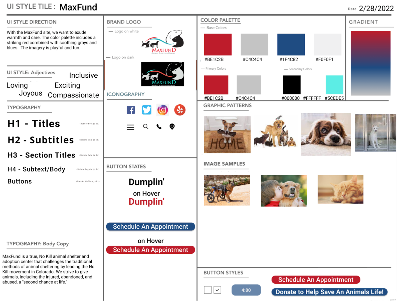
Style Tile
As we completed our initial iterations for the homepage we designed the style tile. The main items we wanted to keep from the original website were the color palette and the logo. We changed the typography and buttons.
Prototype Testing Results
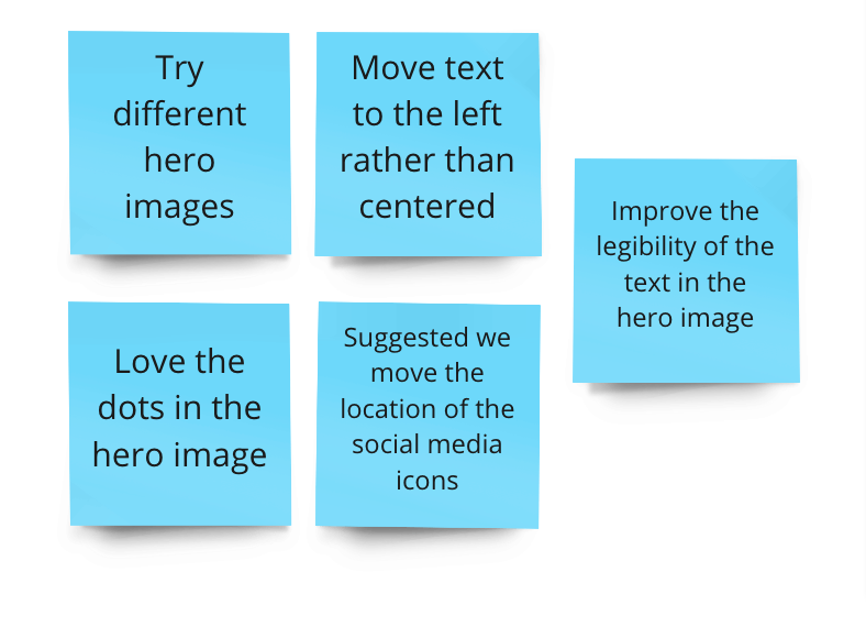
When we tested our prototype, our tests yielded feedback on the design’s layout and functionality.
The feedback:
Iterations
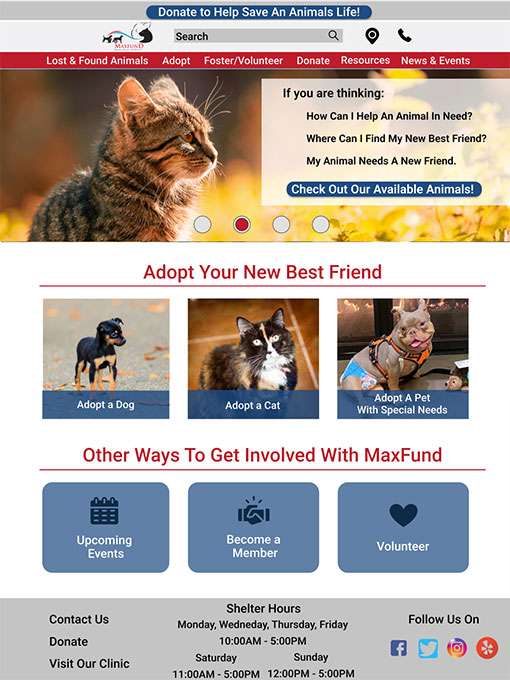
Based on discussions with users we featured adoptable dogs, cats, and pets who might need a little extra love. Users suggested we change the look of our CTA buttons and add in some icons to make it more aesthetically pleasing.


Before and After
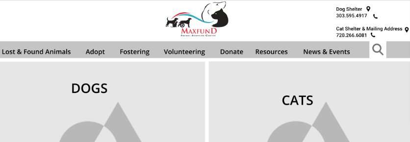
Here is a before and after of the original website and our final prototype.
