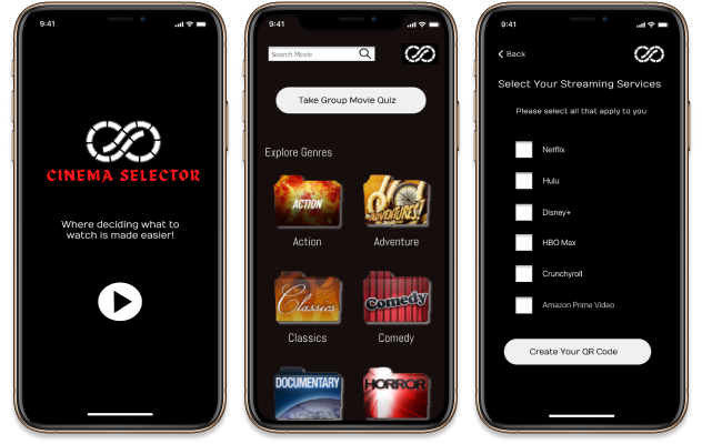
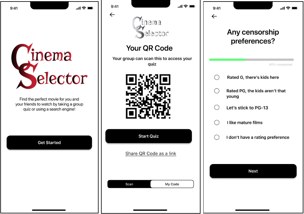
Cinema Selector App
The Problem
People are wasting time trying to agree on what to watch.
The Solution
In our research, we have observed that streaming platform recommendations, like Netflix, are too individualized to accommodate group preferences. This makes movie lovers feel frustrated with how long it takes to decide on what to watch when with a group of people. These frustrations can cause users to argue, become discouraged, and ultimately not watch anything at all. How might we design an app that creates a more enjoyable movie night experience by helping our users agree on what to watch?
Role
UX Designer
User research, research analysis, UX storytelling, usability testing
Desingers
Blair Norris, Elise Rosado, Elias Rosedahl and Andrea Stanley
Background
My cohort was assigned to design a mobile app that solves a real need in a person’s day-to-day life.
As a Team:
- Conducted research to find what users need
- Defined the problem
- Conducted more user research
- Defined the solution
- Created wireframes and a prototype
Research
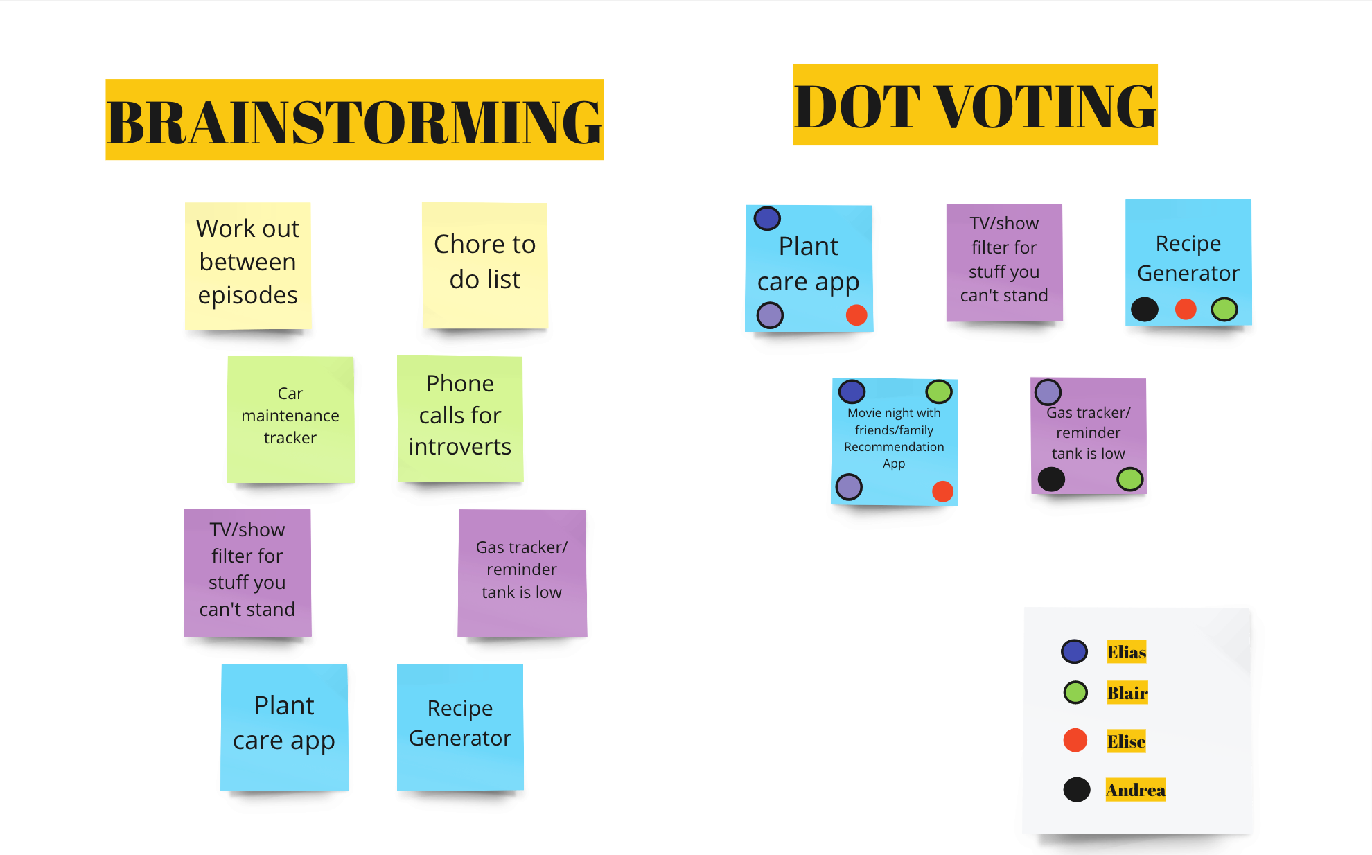
To determine the solution for a need in a person’s day-to-day life, each one of us did some research and came up with 3 potential problems. From there we dot voted on which ones we all though were the best.
Proto Persona
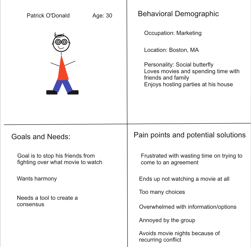
As a group, we chose the recommendation app for movie nights. After determining the problem we want to solve, we crated our proto persona, Patrick.
Competitor Analysis
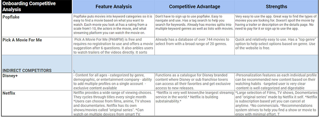
To understand what other similar products are out there, we wanted to do a competitor analysis. This will help us determine if we are creating a new solution rather than repeating one.
What we found is there isn’t a similar product, now we need to find if it will solve the users need.
User Interviews
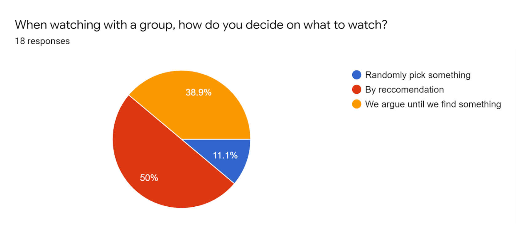
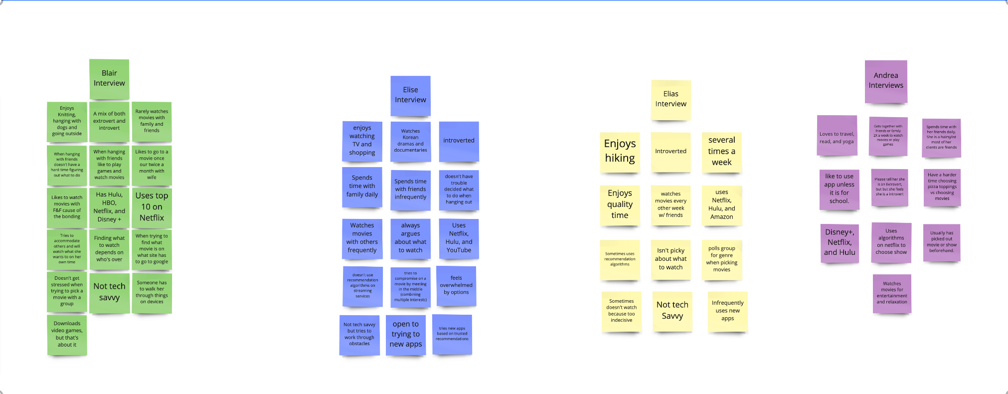
We have the problem and the persona, now it’s time to figure out if this is something that will help users in their everyday lives. We created a survey and posted it on Reddit and we conducted 4 user interviews.
Research Insight
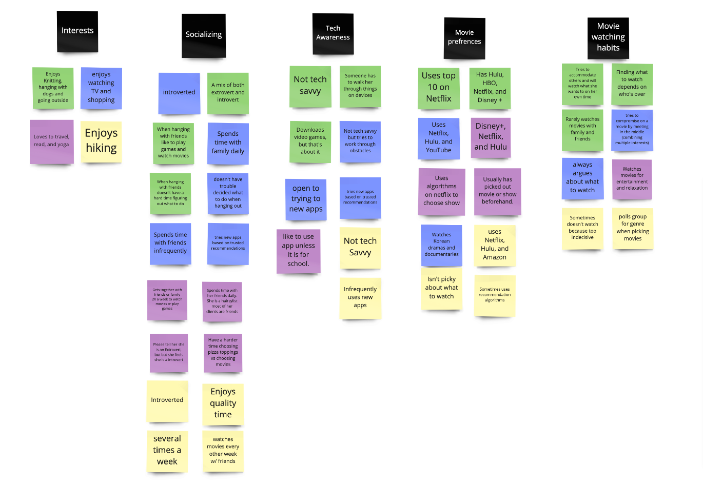
The interviews gave us some great insight into determining the solution. We created an Affinity Diagram to organize the feedback.
Most consistent feedback:
- “I like when I get recommended something I’ve never seen before”
- “It’d be nice if there’s a way to do a group quiz to recommend what to watch”
- “There was a way to enter the streaming service you have and it shows you what movies are available for you”
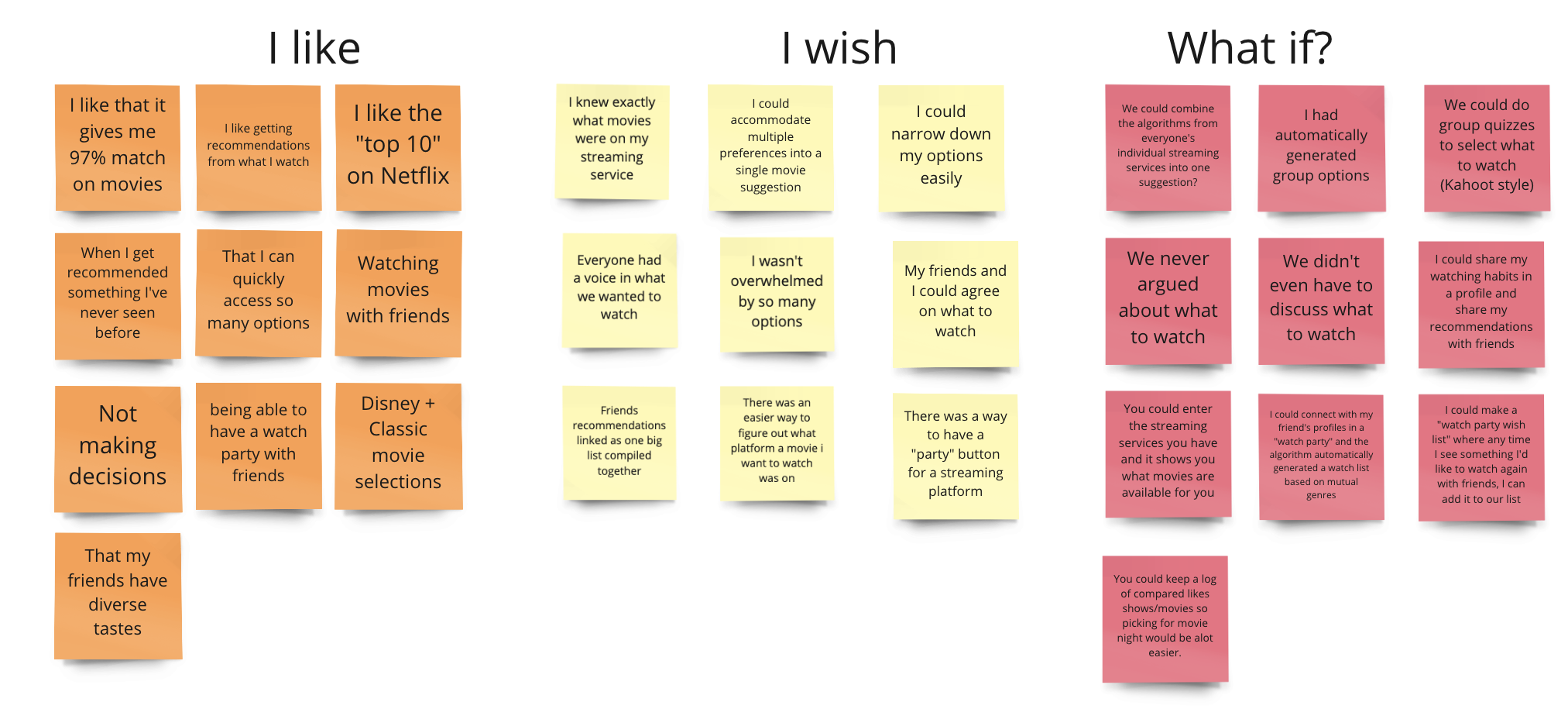
I like, I wish, What if?
To help us get more insight into the user’s needs, we created an I like, I wish, what if diagram based on our user interviews.
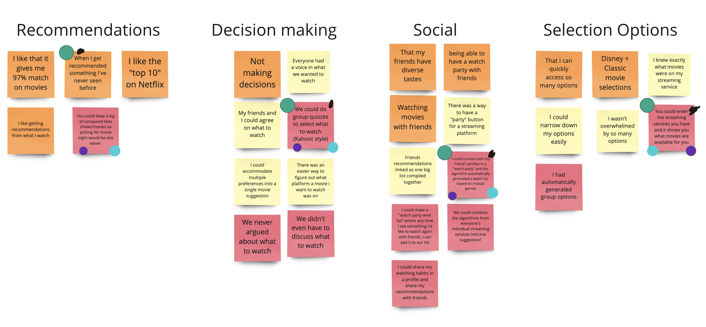
To organize our thoughts we grouped them into categories and dot voted the most relevant points.
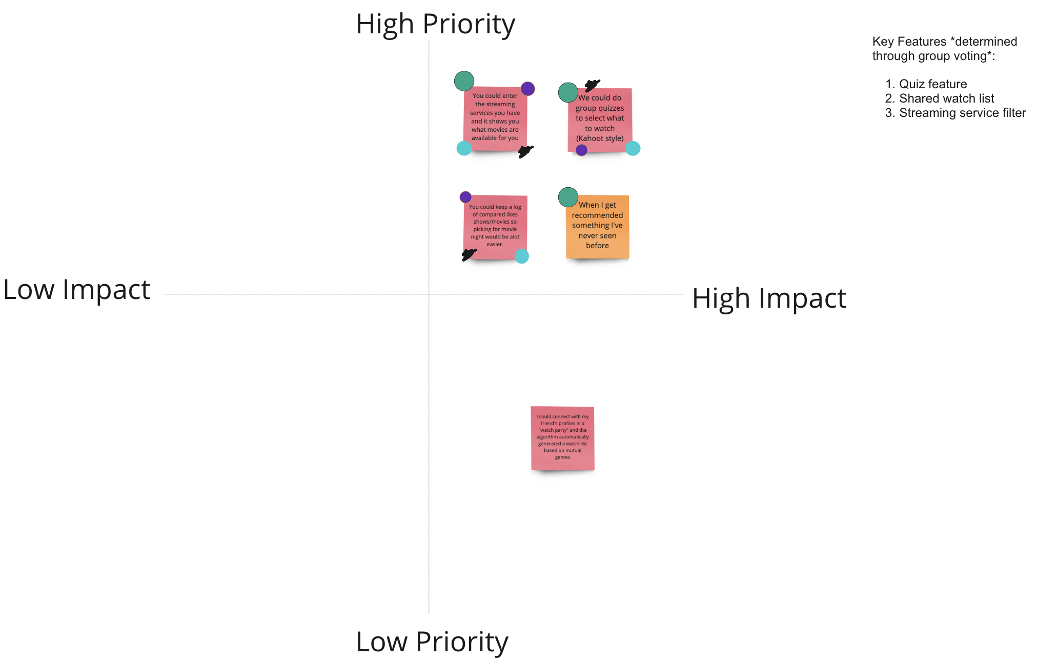
After dot voting we placed the winners into a feature prioritization matrix. This helps us to find the 3 key features we will solve in our app.
Storyboard
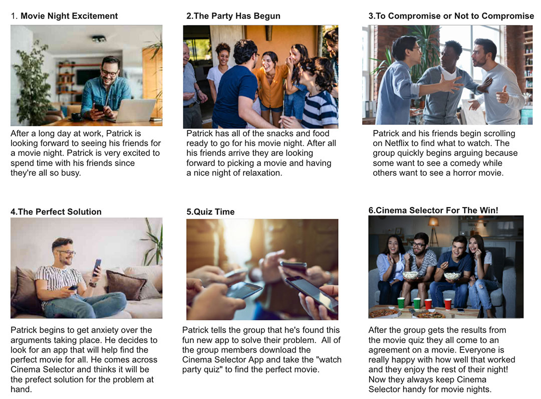
Now that we’ve found the solution, it’s time to see if it will help Patrick with his problem. In this story, you will see how it will benefit Patrick and help alleviate his struggles.
User Flow
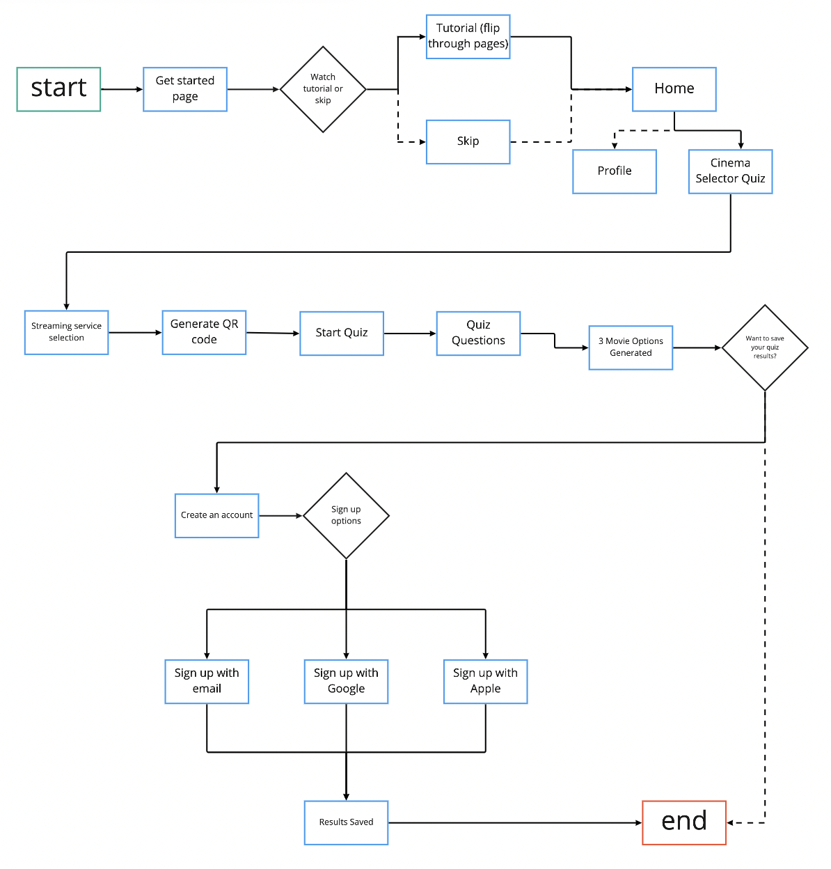
Before we start the wireframing, we need to determine the user flow. As we create this app, we are focusing solely on the happy path.
Low-fidelity Wireframes
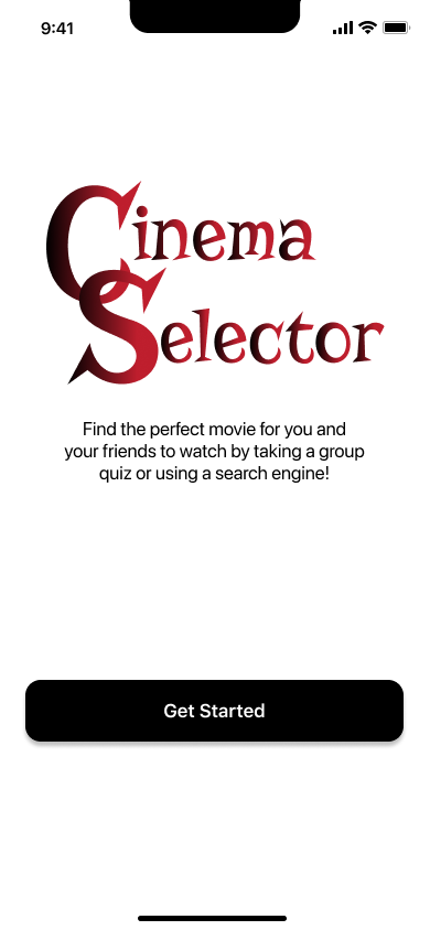
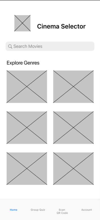
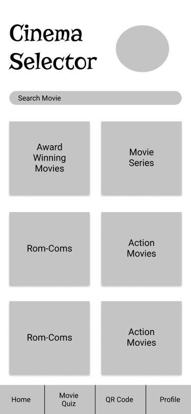
Each group member created their own low-fidelity prototype based on the user flow we created. Once we finished our wireframes, we tested each other and voted on which one we wanted to be the main wireframe. We selected one and ended up using the ideas from each other’s wireframes to create our finished product.

LoFi Testing Insights
Once we updated and designed our first low-fidelity prototype, we conducted usability testing.
The Feedback:
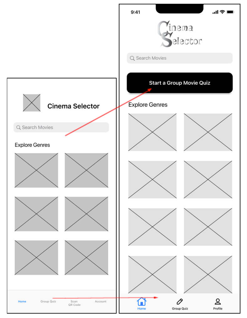
- Users had dificulty finding the “Group Quiz” page.
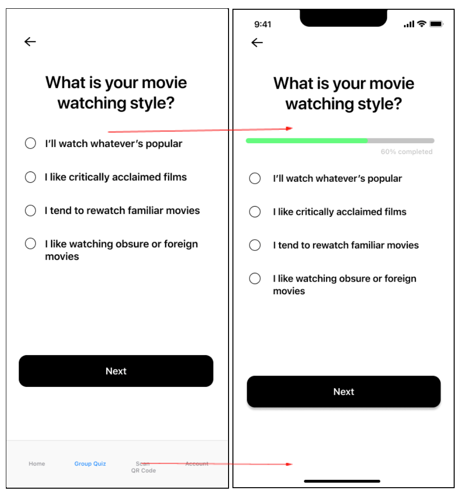
- Users wanted to know what their progress was while taking the quiz.
- Users didn’t like the menu bar in the quiz.
The Iterations:
- Added a group quiz button at the top of the homepage.
- Added a progress bar in the quiz
- Removed the menu bar while users were taking the quiz
Low Fidelity Final Prototype
For our assignment, we only needed to create a low-fidelity prototype. Below you will find the link to this prototype.
